Exhibit #7: Text Styles
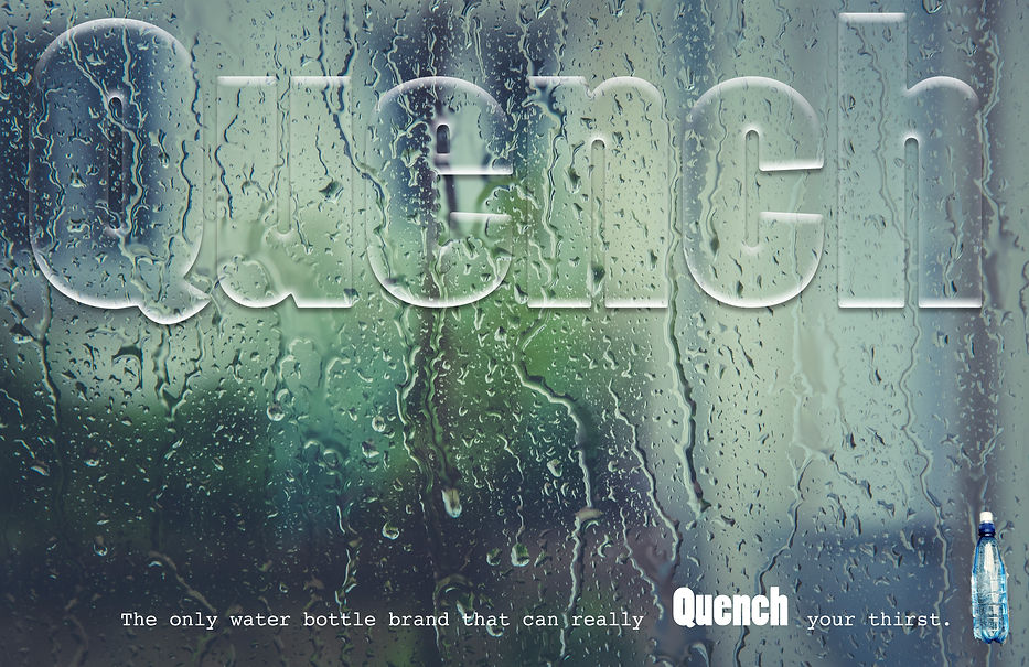
When I created the "Water Drop"style, I thought it would be a really cool style to use for an advertisement for an imaginary water bottle company. I knew I wanted to include a small image of a water bottle to make sure you could tell what the ad was for. I found a large workout image that had a water bottle in it, and I used the quick selection tool and copied it from one image inserted it into my ad. Before this class, I would have used the lasso tool and it would have taken forever. I wanted to contrast the two fonts while keeping the word "Quench" the same font for repetition. I tried to pull different colors from the background for the bottom text. I thought I could make some cool consistency with those beautiful colors in the background. I tried the dark blue, the light blue, and the greens. Unfortunately, none of the colors stood out enough to be noticed so I stuck with white. The background image is from pexels.com and the water bottle is from an image from pixabay.com.